Local websites
Drawing on best practices and extensive expertise, FlowRepublic delivers high-level coaching and training programs designed to elevate the skills of professionals and Salesforce partners. Their mission is to strengthen collaboration across both technical and interpersonal dimensions, ensuring long-term success. Trusted by leading organizations such as PwC, Deloitte, Cognizant, Cloudity, and Silverline, FlowRepublic is widely recognized for helping companies remain competitive in today’s fast-changing digital environment.

To help the client stand out, Qflux was tasked with refreshing their outdated brand identity and digital presence. Our first step was rethinking the brand guidelines to give the website a modern, innovative look that aligned with FlowRepublic’s vision.
Another critical task was improving navigation and creating a user experience that was seamless, intuitive, and consistent with the client’s sitemap and overall architecture.
We also had to define a new illustration style that could highlight the company’s flagship services while giving the brand a more engaging and recognizable visual language.
A further challenge was developing a cohesive design system that would unify the corporate website with both digital and printed educational materials, ensuring consistency across all touchpoints.
Finally, the project scope included producing a library of branded assets for social media, with tailored imagery and design kits for LinkedIn and Twitter.
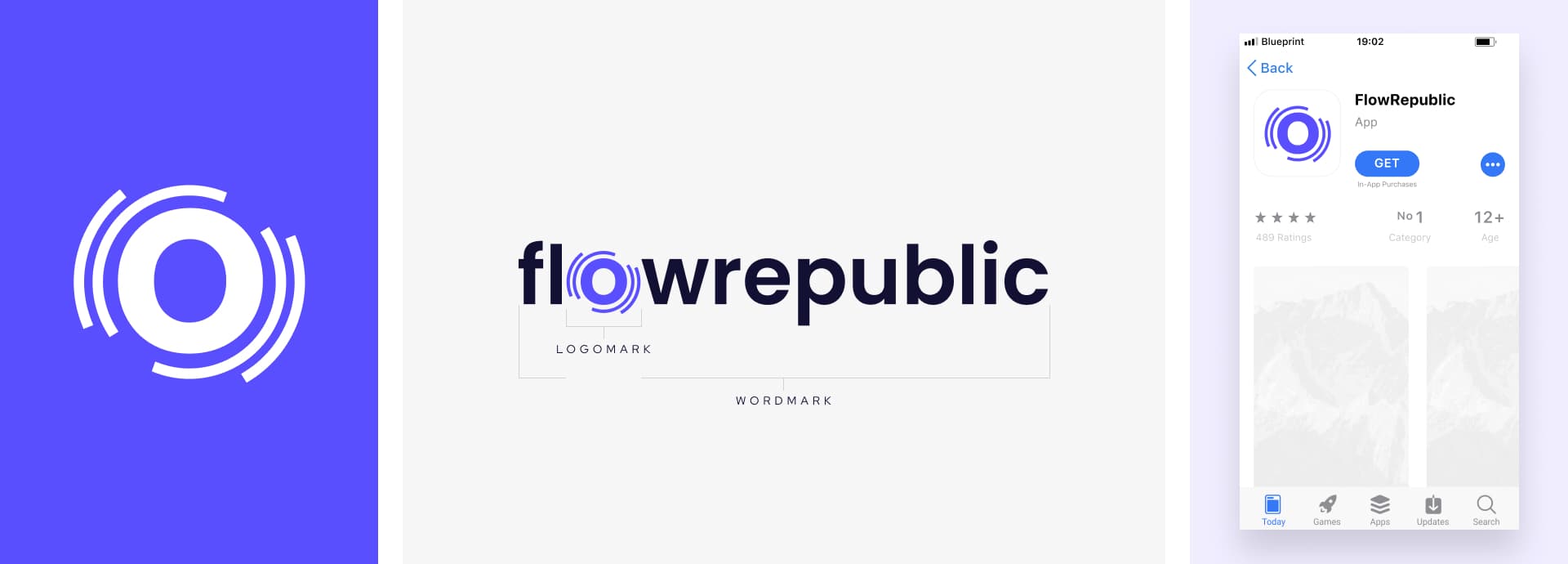
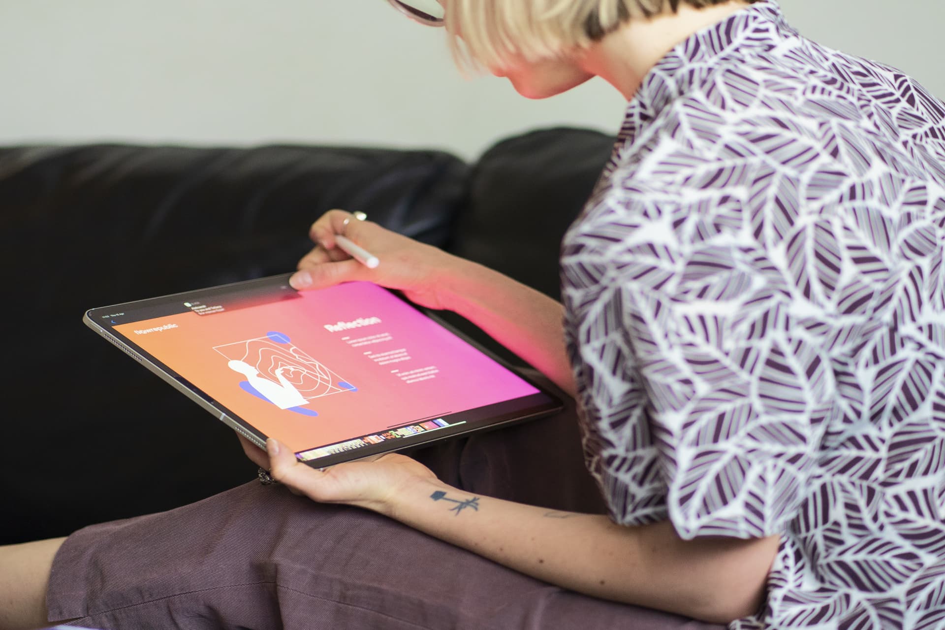
Our design team delivered a comprehensive solution that met all these goals. We introduced a dynamic design system that bridged the corporate website with FlowRepublic’s educational resources, applied a vibrant new color palette, and refreshed their minimalist logo to give it a contemporary edge.
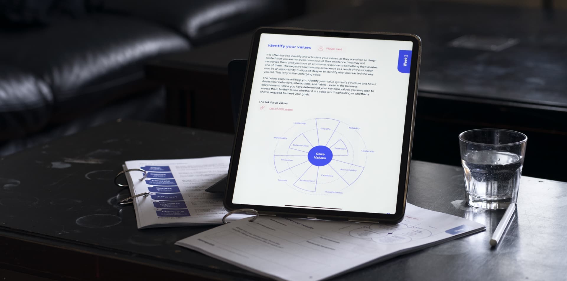
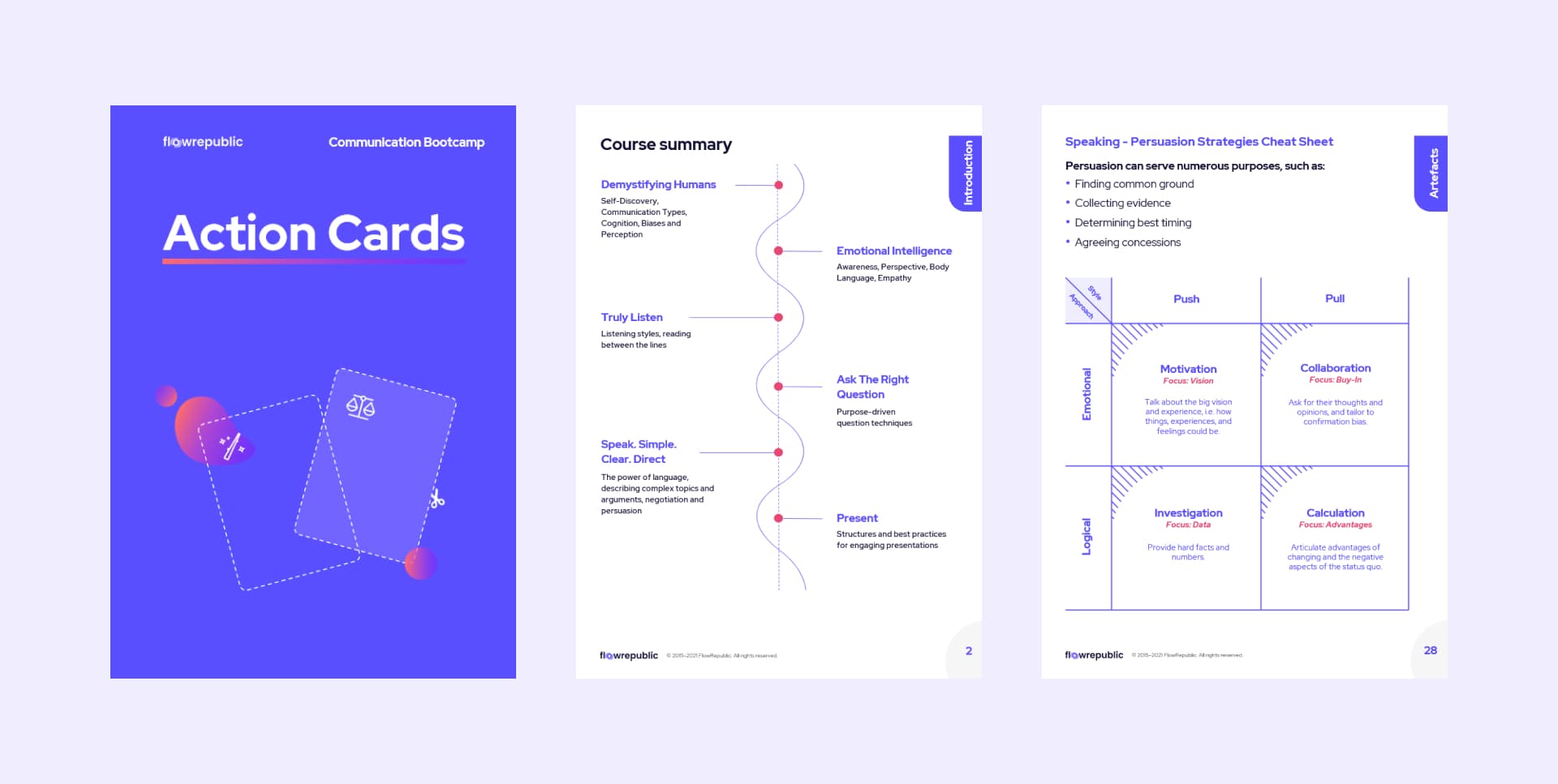
For the learning experience, we focused on clarity. Minimalist infographics were paired with abstract, modern visuals to direct attention to the course content. We also created reusable internal templates, allowing FlowRepublic’s team to update materials independently. The new website architecture combined with updated UI and an SEO-driven strategy gave the platform greater visibility on search engines like Google and Bing.
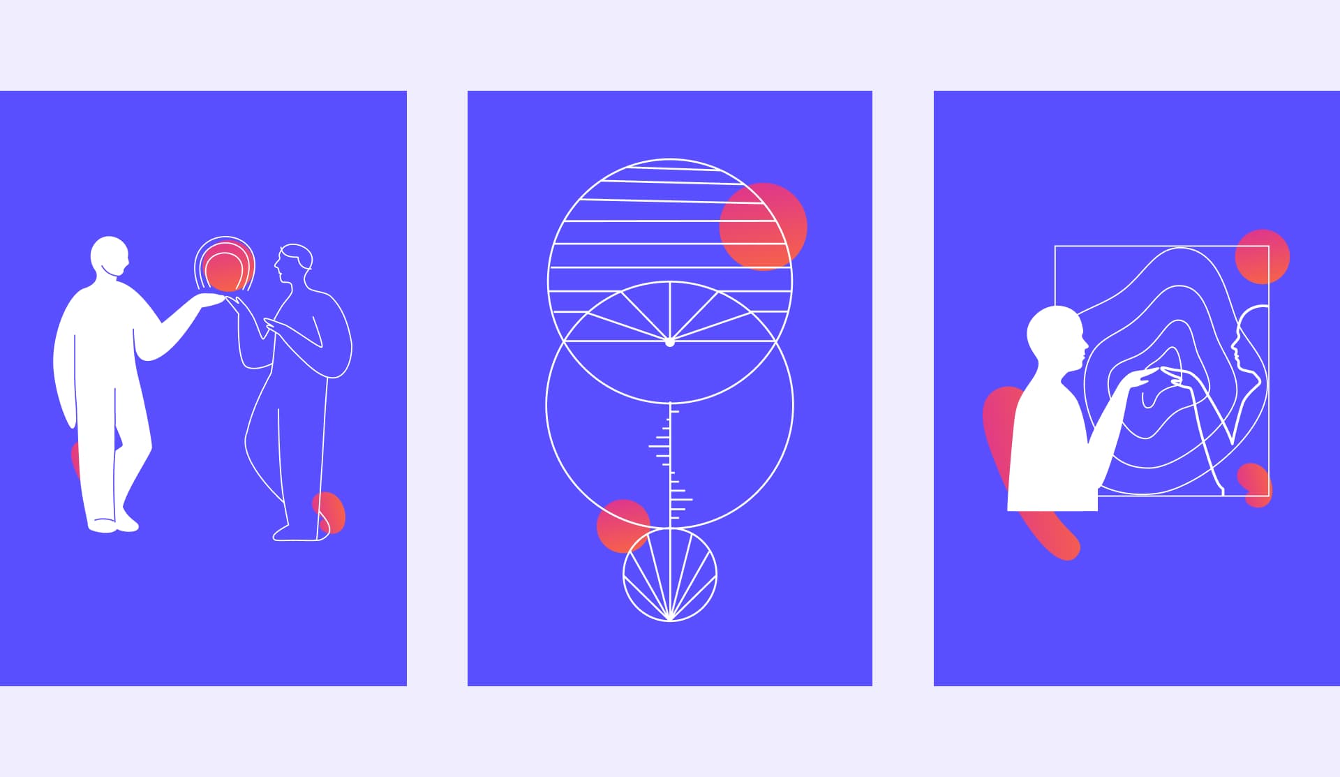
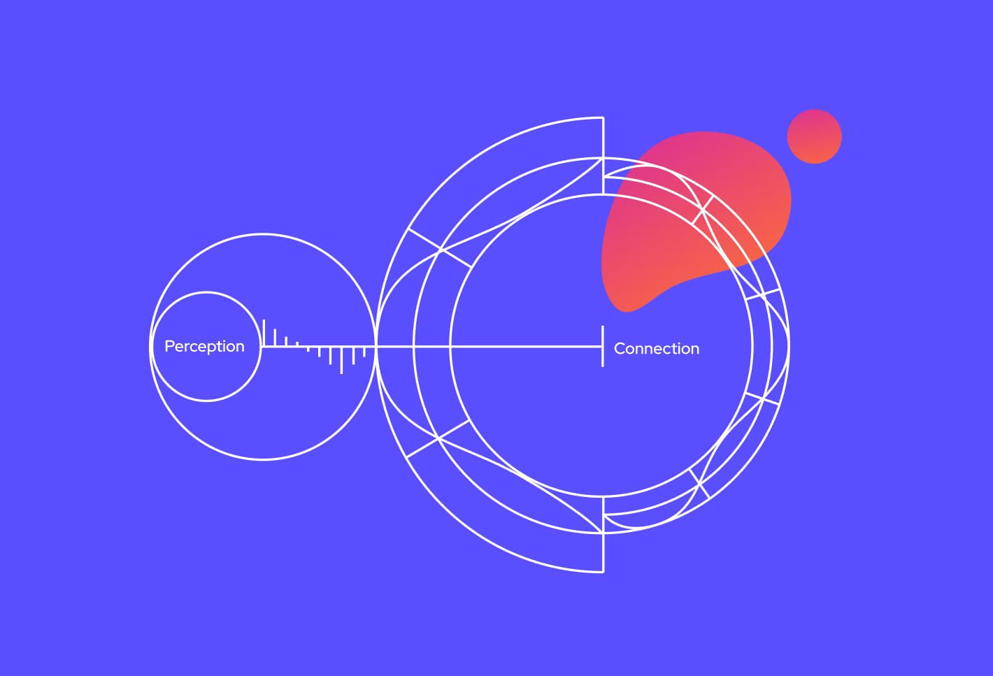
When developing the visual style, we considered FlowRepublic’s unique mission: teaching soft skills such as empathy and communication to highly technical professionals. This fusion of opposites inspired the design approach. A fresh blue symbolized innovation and progress, while warmer accents in orange and crimson introduced energy, warmth, and human connection.

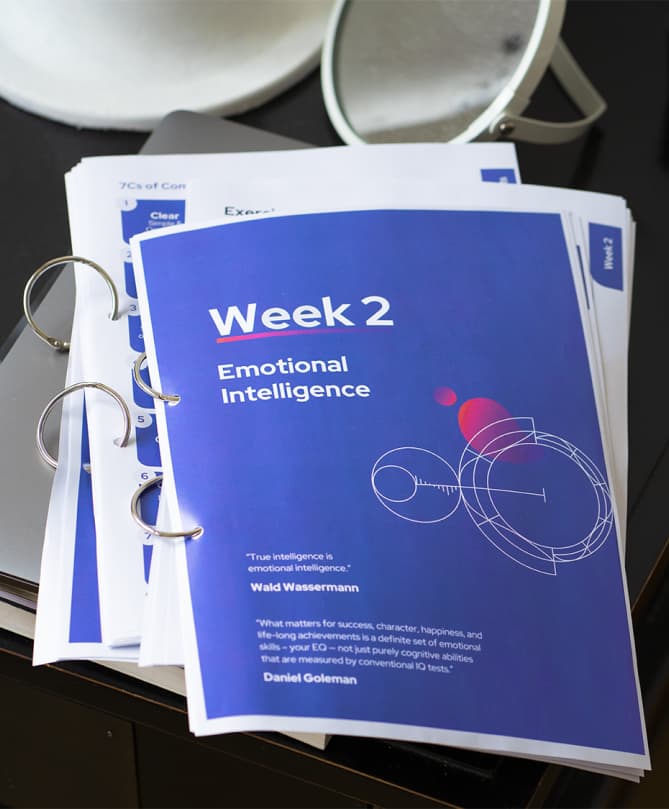
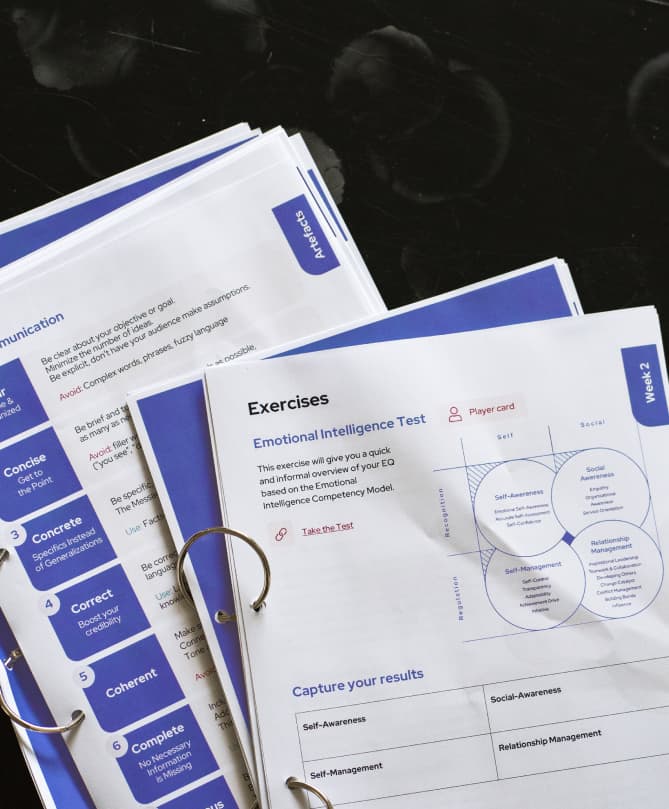
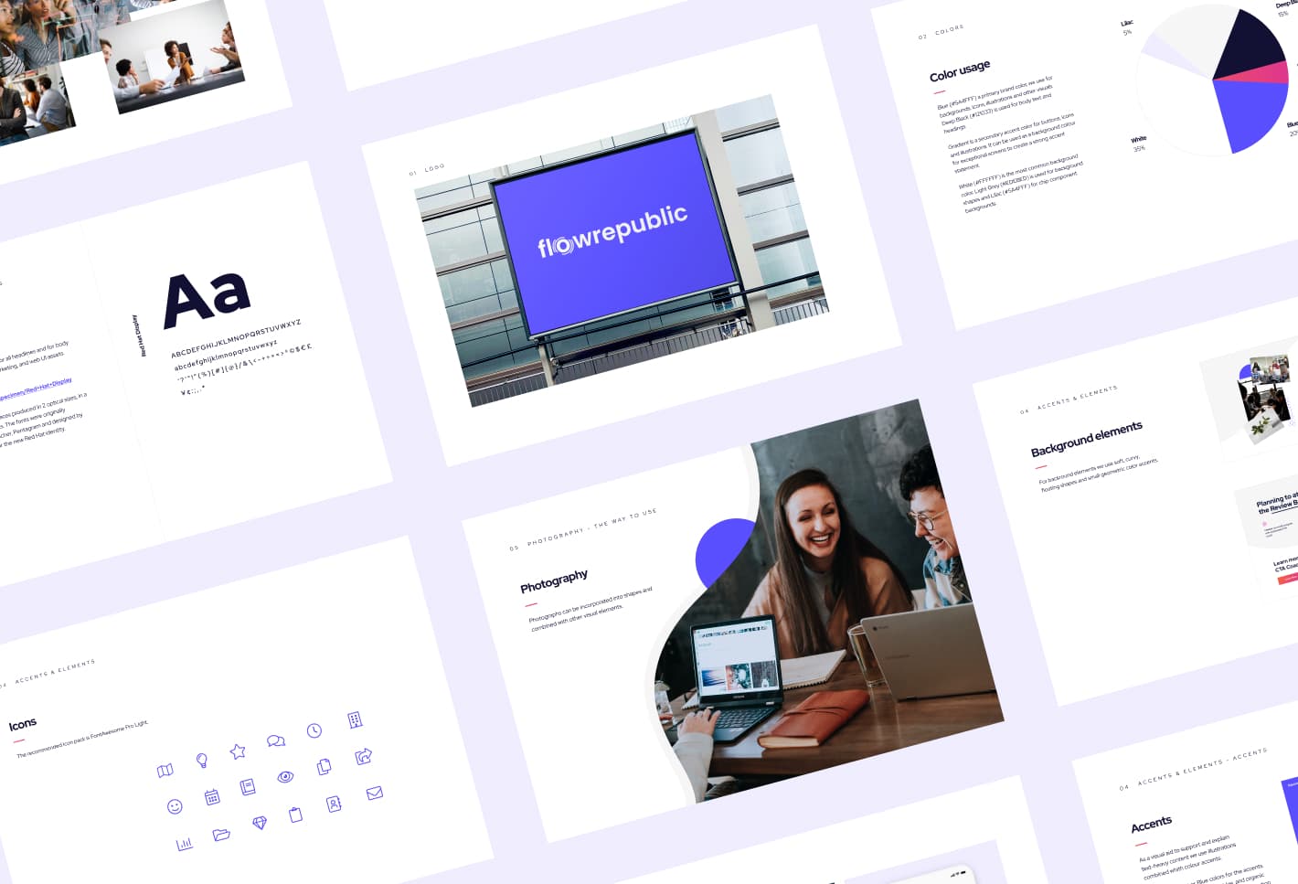
Typography followed the same principle. We chose Red Hat Display, a geometric sans serif that is not only highly legible but also rounded and approachable, reinforcing the friendly and accessible tone.
Custom illustrations tied everything together. By blending abstract elements with depictions of people interacting in real situations, the visuals mirrored the balance between science and humanity, logic and emotion is a core concept behind FlowRepublic’s brand identity.