Local websites
Brokeree is a technology-driven company that equips brokers with flexible software products and tools to support their business growth. They deliver advanced trading plugins, platform servicing, and integration support, helping financial professionals adopt the latest market solutions. However, their website was struggling under a cluttered and outdated structure that no longer reflected the company’s innovative spirit. Qflux stepped in to assist with rebranding, UI/UX redesign, and full-scale web development.
Because Brokeree operates in a fast-paced, high-tech industry, their digital presence needed to mirror that level of sophistication. Instead, the site was overloaded with disjointed information, mismatched illustrations, and icons that failed to align with the brand’s identity. Its design felt outdated and cumbersome. Our challenge was to modernize the look, re-energize existing design decisions, and add new, visually coherent imagery that better communicated the company’s forward-thinking values.
Another major issue was the lack of a clear information hierarchy. The site’s architecture was confusing and ineffective, preventing users from quickly accessing the details they needed.
On top of that, the product menu and category pages were frustrating to navigate. Broken filters, poorly structured layouts, and non-intuitive navigation all contributed to reduced usability, slower load speeds, and weakened SEO performance.
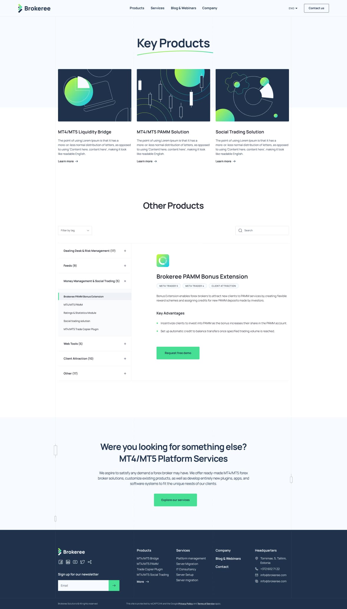
To tackle these challenges, the Qflux team broke the project into several key areas of improvement. First, we refreshed the website’s foundation, reimagining Brokeree’s brand elements with a cleaner, more polished style while introducing new design components that aligned with their corporate identity. Second, we streamlined navigation and eliminated unnecessary clutter. The site was rebuilt to be responsive, mobile-friendly, and faster overall, boosting both user experience and search rankings.


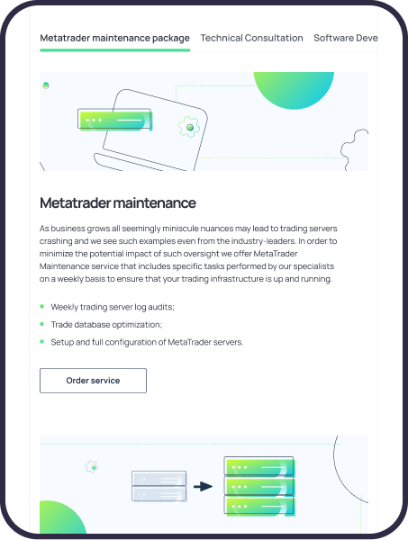
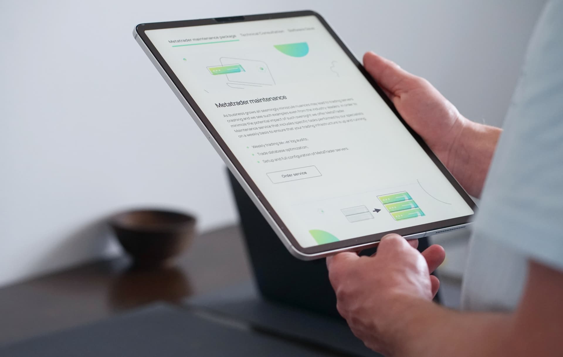
This was achieved through a carefully planned information architecture, minimalist UI, restructured service pages, and a redesigned set of icons and illustrations. These visuals highlighted the technical nature of Brokeree’s products while keeping the interface simple and intuitive.

When defining the design approach, we studied Brokeree’s positioning within the fintech space. Although finance is often portrayed with a strictly formal tone, we wanted to reveal a more creative side of the brand – the communicating professionalism with a modern, minimalistic flair.
We began with a logo refresh. Rather than a complete overhaul, the original design was refined to maintain brand recognition. We selected clearer, future-oriented colors, introduced a gradient for dynamism, and paired it with a streamlined, modern font for better readability.
For the website palette, we used calming green tones with dark blue accents for CTAs and highlights. These choices projected reliability and stability, while rounder, softer fonts improved readability and user comfort.
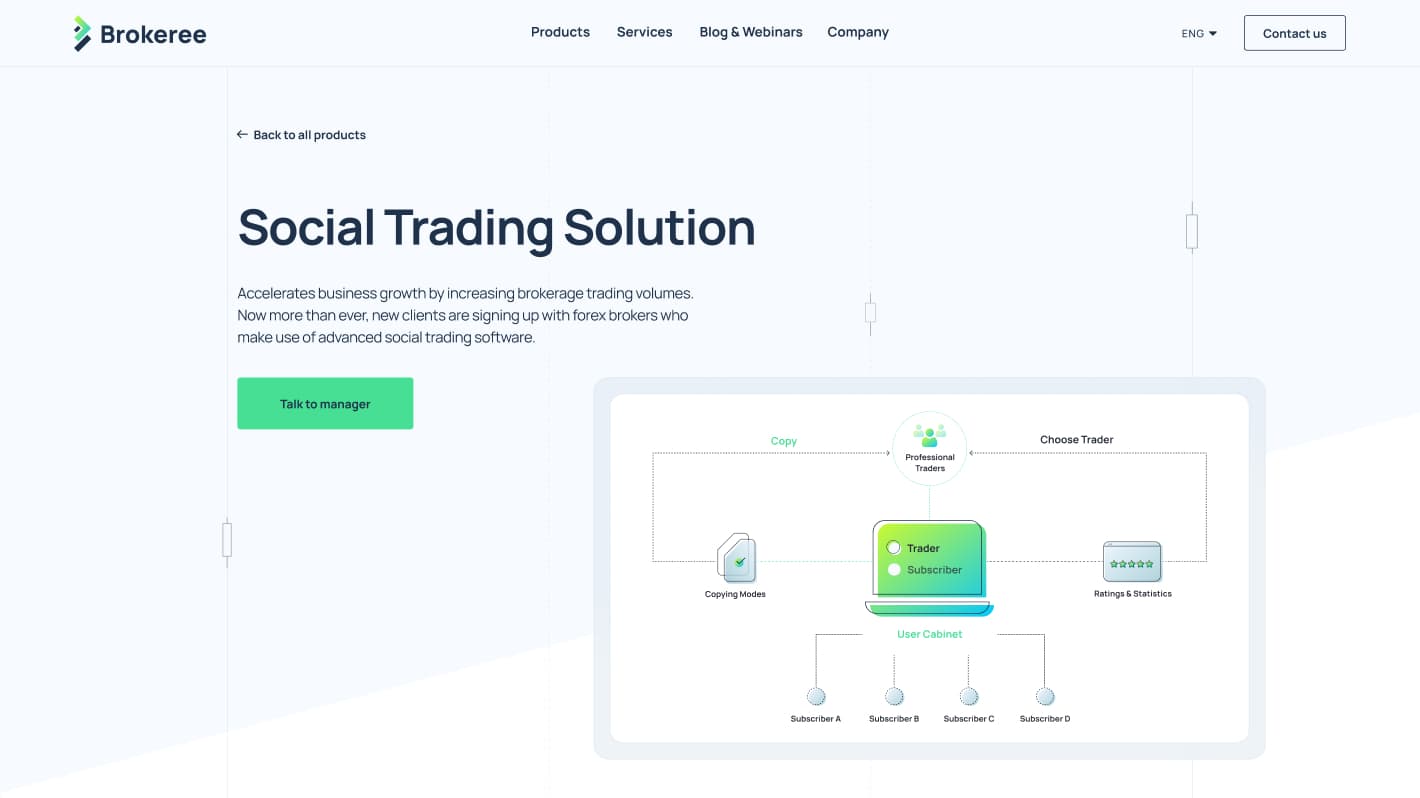
The visual system was extended with custom iconography and illustrations. The earlier site was overloaded with infographics that didn’t always serve their purpose. Our team reduced the number of visuals, redesigned product imagery, and adopted a minimalist style to reduce visual noise while maintaining clarity.

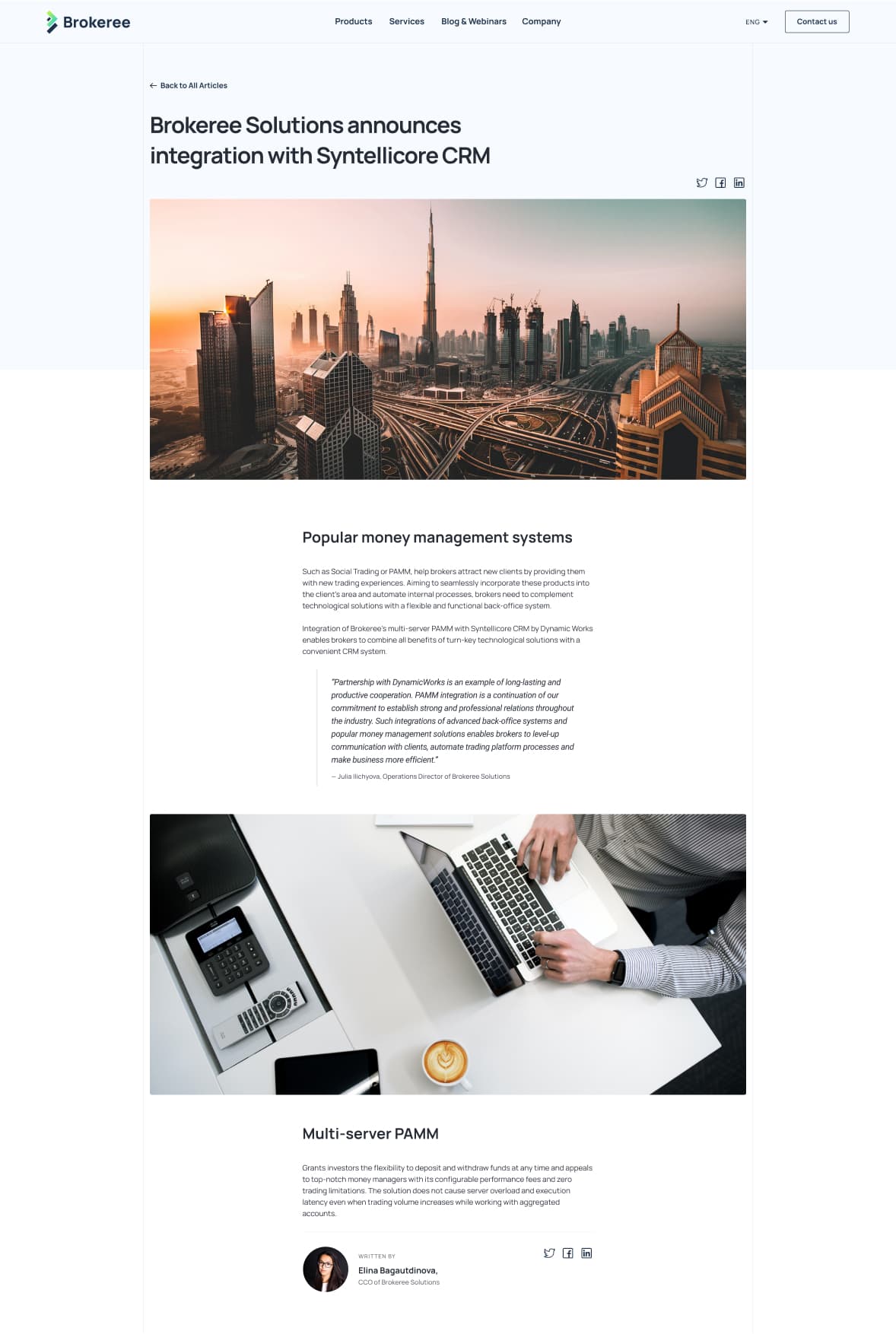
We also reimagined the homepage centerpiece: candlestick charts. Since they are integral to Brokeree’s work and identity, we transformed them into a dynamic visual element, animating the charts along their lines with a parallax effect. This subtle detail not only symbolized market volatility but also added a modern, artistic dimension to the design.
Navigation for product and service pages was restructured to be intuitive and user-friendly. Category names were moved to the left with detailed descriptions on the right, making it easy to browse through options. Each key product and service was paired with unique illustrations to strengthen recognition across the site.